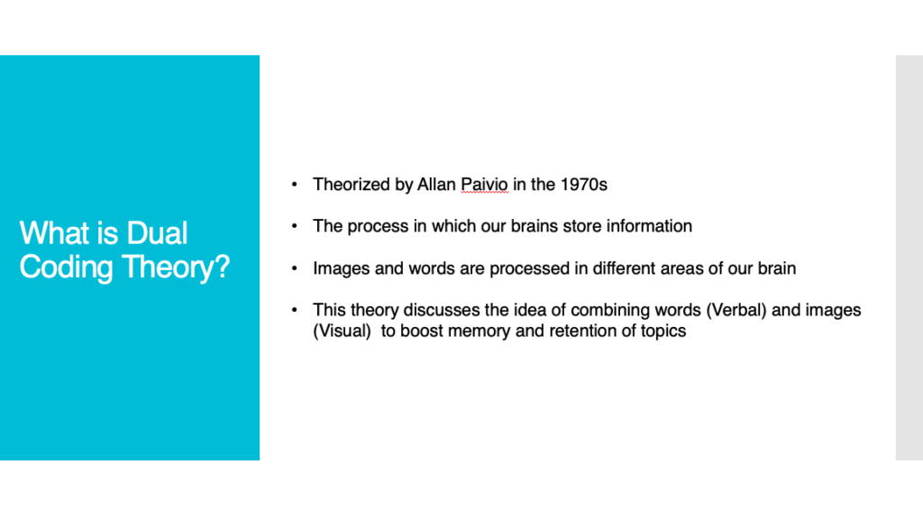
For this blog, I will discuss how I revamped my PowerPoint presentation from earlier in the term to satisfy multimedia learning principles. I will provide an explanation for each principle and include before and after screenshots. Subsequently, I will elaborate on how these changes can increase the chances of memory retention within learners.
I will first discuss the Coherence Principle and its effect on knowledge transfer. This principle states that people learn better when extraneous material is excluded rather than included. My PowerPoint from the start was quite bare, however, certain images I added just didn’t provide any benefit for the learner and would just confuse them. Here is a screenshot of a slide displaying an image of gears, which in hindsight doesn’t need to be there:

By excluding the image, this ensures that the learner wont become confused. The image itself didn’t provide any significant meaning, but was added to fill blank space. Less information that is not needed, the better. Here is a screenshot of the updated slide:

The next principle I would like to discuss would be the Signalling Principle. This principle states that people learn better when essential words are highlighted. In retrospect, my PowerPoint did not emphasize certain words which doesn’t follow this principle. Even for myself, I find it much easier to remember information when certain words are highlighted and stand-out from the rest of the presentation. Here is an example of not using the Signalling Principle:

By highlighting essentials words, this can reinforce the main idea we want our learners to retain. This simple change can drastically improve memory retention, just by simply remembering the highlighted word or colour. Here is a screenshot of the Signalling Principle in practice:

The last main principle I would like to discuss is the Split-Attention Principle. This principle discusses the idea learners split their focus between two or more sources of information, which negatively affects memory retention. During my original presentation, I had included multiple points on each slide which could draw a learner’s attention in multiple directions. These points were quite specific and needed to be understood separately. Here is an example:

My revised presentation made sure to separate each point by slides. Learners are now able to focus on one piece of information and then move onto the next. As mentioned, I felt these points needed to be separate in order to reinforce the importance of each one. After reading this principle and applying it to my PowerPoint, I can understand how important this principle can be when creating presentations for learners. Here is the updated below:

Overall, I feel the I’ve been able to enhance my PowerPoint by understanding and applying each principle. The main goal would be to provide a presentation that doesn’t hinder the learning process for students. As I am making these changes, I’m reminded of all the presentations I’ve made and how beneficial it could have been to utilize these principles. Please see below for my updated PowerPoint.
Leave a Reply
You must be logged in to post a comment.